If you’re one of those who think ‘I just skip popups while visiting websites’, we will say, you’re not alone. Because more than 73% of internet users usually skip or overlook popup ads while browsing any website. And the most common reasons are –
- The copywriting is not standard
- Contains full of useless information
- The user guide is not well-maintained or confusing
- It appears again & again
- Asking too much information
- Showing irrelevant things almost on every web page.
However, a well-executed popup ad not only has the ability to impress audiences but also helps them to make a choice and become your loyal customers. Therefore, if you want to make your popup design more appealing & attention-grabbing, you need to follow some smart implementation tactics.
So in this post, we’ll share some effective design tips for your popups from our own research with real-life examples. It will help you to improve your design. Moreover, it will create an ever-lasting impact on your visitors that will generate more leads.
In the end, we have also shared some really good plugins to design such popups, let’s get started and keep reading! 😊
Quick Navigation
Some Interesting Facts About Popup

A popup act like a placard. The way a placard creates a visual appearance on the mind, the same way a popup helps visitors to understand the website’s intentions quickly.
However, popup ads have both good and bad effects. Either it can directly impress users and increase customer engagement, or it can annoy users and harm your brand reputation. So the entire process is in your hand, whether you want to make your users feel happy with your popup or not.
Anyway, let’s check out some of the interesting statistics about Popup.
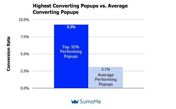
- The average conversion rate of the best popup was 9.28%
- More than 1,388 people receive popup ads per day with a conversion rate of 11%
- The average email CTR across all industries is about 2.61% – MailChimp
- Popups helped marketers to increase subscriptions by 86% and sales by 162% – Entrepreneurs
- Businesses who utilize exit popups at the time when a user tries to exit the website, can experience an improvement in sign-ups by 600% – Convert XL
- The proper use of popups in eCommerce sites can produce robust conversations among marketers – Campaign Monitor
- On average, a small/medium business owner needs their opt-in form to pop up for 158 to get one subscriber whereas a large business needs an opt-in form to popup 144- Gillandrews
- Executing a popup instantly boosted our email list opt-ins – CopyBlogger
👉See more statistics about popups👈
Different Types of Popups Used By Websites Owners
There are different types of popups you may notice while visiting the website. In this case, these 6 types of popups are the most popular and most used,
- Entry popups: When visitors enter the website.
- Time-delayed popups: After spending some time, for example, 30 to 60 seconds on the website, it pops up.
- Scroll-based popups: After scrolling down or up, it appears on the screen.
- Click popups: Based on the user’s click.
- Exit-intent popups: When users intend to exit from the website, it shows up and asks you to enter your email address.
- Email popups: This popup basically designed for collecting email addresses. Through this popup, email marketers utilize the data for their email campaigns.
Popup Design Best Practices You Can Apply To Your Website
As a website owner or a digital marketer, your business goals may differ according to your niche & purpose. However, the initial goal is the same, generate leads, increase sales, or produce more web traffic. right?
So, if you’re aiming to design your first popup and want to generate amazing results through it, here are 6 pro tips to improve your popup design.
01. Try to Combine Your Popup & Website Colors Carefully
Well, colours can play an impressive role to make a website more attractive and professional. It can remove monotonousness and give a meaningful idea, especially it carries the brand identity. However, the wrong combination of colours can ruin your website.
Businesses of all sizes and in all industries have traditionally used colors to communicate their branding when designing logos, product packaging, and websites
Picreel
The same goes for using popups. What if your popup design doesn’t match your website? Well, it will not only irritate your visitors but also give the message that you are not sincere.
So, do make sure that you’re using the correct colour combination, especially while presenting popups. You need to make sure you are doing the right things while using colours on your popup like,
- Try to mix up your popup & website colour
- Popups should not contain high-contrast colour
- Take the help from Adobe colour for a live colour test
Let’s take an example of Platinum Trading Academy, they use a transparent colour on both the website and popup. So the entire design looks so elegant. Also, the CTA button with red colour creates an urgency to get the consultancy.

02. Utilize Time-Delayed Popups
Users should be given at least (10 seconds, 30, or 60) on a website so that your audience can relate, understand & interact your purposes
My OptiMind
So, you need to be careful while using the Time-delayed popup types. The waiting time can be different depending on the content of your website.
In short, it should appear after a user has spent a certain amount of time on your website. Otherwise, if it appears after just a few seconds, visitors may feel annoyed.
Time-delayed popups are really effective and more powerful in terms of increasing customer engagement than other popups. That is why most websites are using this popup.
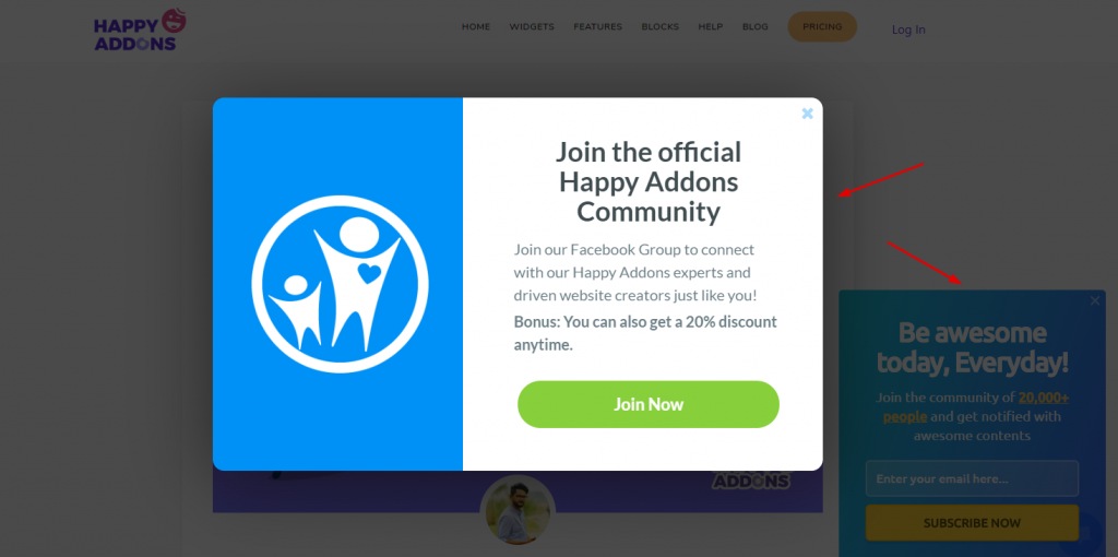
If we take a look at Happy Addons, the popup appears after spending one and a half minutes on their website. Also, you will notice that the design of the popup is unique and tells users to join the Happy Addons community.
This is really a smart trick and you can implement this trick on your popup designs to grab more attention & increase your customer base.
03. Implement New Things Wisely

If you want to bring new things to your popup, no problem, go for it. But you have to be sure whether it will work or not. In that case, you can always A/B test your ideas before utilizing them on your popups.
Your testing should focus on the following:-
- Colour combination (looks okay or not)
- Fonts & text size
- Popup banner size or ratio (fit to the screen or not)
- Objectification
- Suitable pages for showing popups (which page is the best for showing popups)
- Content relevancy (are they catchy or looks ordinary)
- Time-delay ( which timing works fit best, the 30s, 60s, or more).
So, you must find out these important things after testing to ensure your popup is ready to perform.
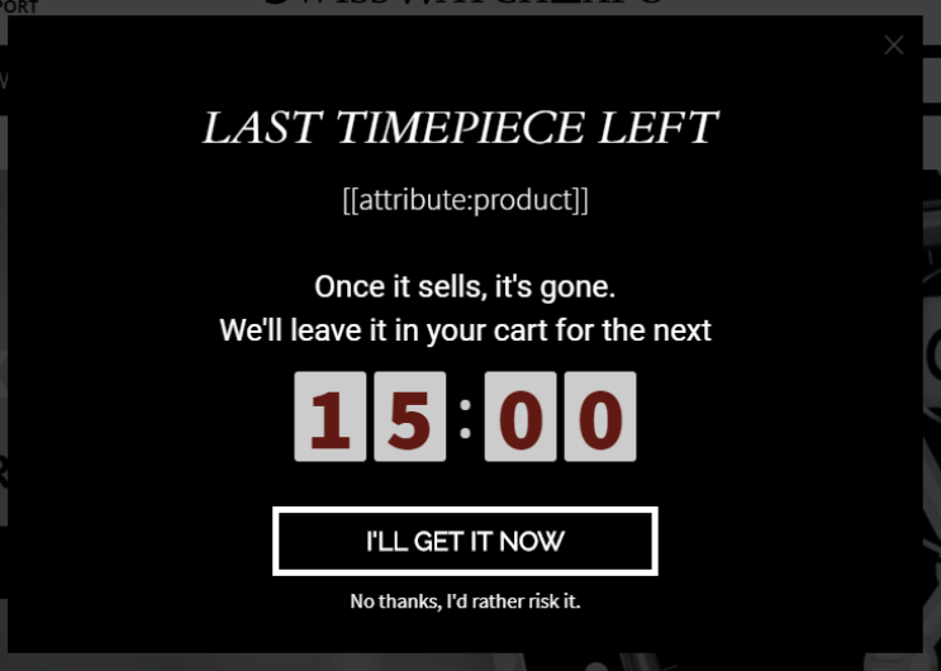
Let’s look at SwissWatchExpo. Basically, they wanted to A/B test their entire content design and figure out what can engage their customer better than before.
As a result, they found that by creating urgency in the popup, they were able to increase conversions by 17% with this popup.
04. Give Users A Clear Guidance
To stand out with your popup design, always try to use attention-grabbing words to pursue your users. For instance, you can put a tutorial or video (How to use, or use cases) that will raise curiosity among the users and also create a chance to get more engagement.
Let’s see what should you implement on your popups to give users a clear direction:-
- Catch their attention
- Clearly elaborate the user benefits (Gaining customer trust)
- Offer your pledge (Now hook them with deals, offers & discounts)
- Engage them with the CTA button (Let them finalize the process)
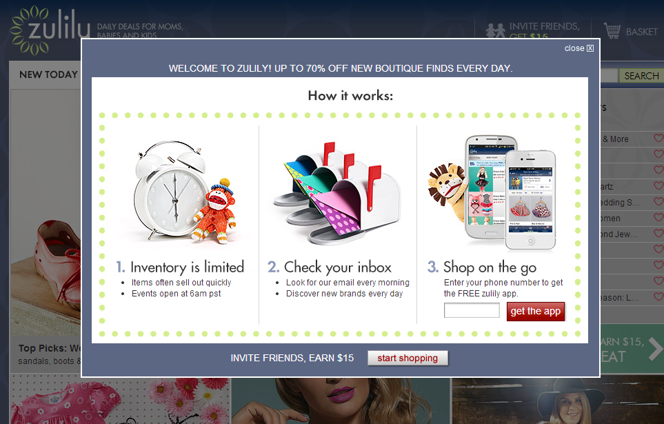
If we look at Zulilu, it will give you an overall idea of how you should guide users in a smart way.
As you can see, they created a story; divided the sections into three parts. Also, you can notice that at the bottom of the popup, asks users to refer a friend & earn $15. So overall, it’s a nice example to follow and apply.
05. Your CTA Button Should Be Clear & Understandable
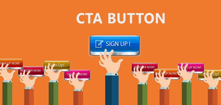
CTA buttons should be clear, well-optimized. Also, it must have the ability to impress users.
More than 90% of people conduct with your CTA button while reading any headline (It should be popup, Banners, Blog posts, etc)
DSIM
So, keeping that in mind, you need to make sure that your (CTA) call-to-action is well-optimized, also it must include data-driven copies to persuade visitors to click on your popup.
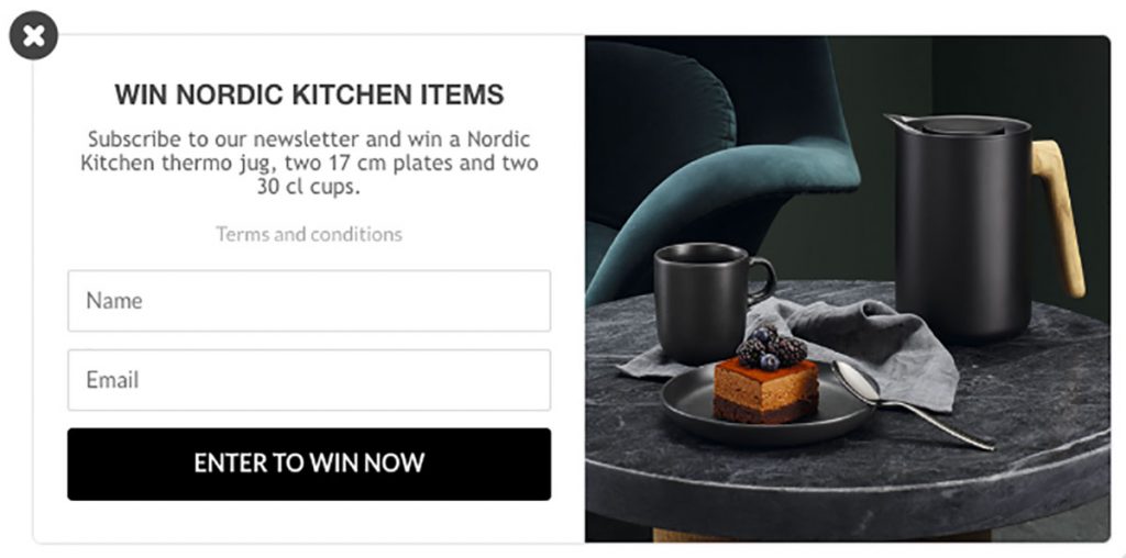
The CTA button from Eva Solo clearly focuses on the offer, “Enter To Win Now!“. Also, they use the Black & white color combination that looks so astonishing.
06. Use Fewer Fields on Your Popups
Another way to maintain a robust relationship with customers is, adding fewer fields to popup messages or ads. Just think of yourself as a customer and you’re asking to fill out a popup form with too much information. It is both irritating and time-wasting to type your personal information into a popup, right?
Well, let’s take a look at the image below:-
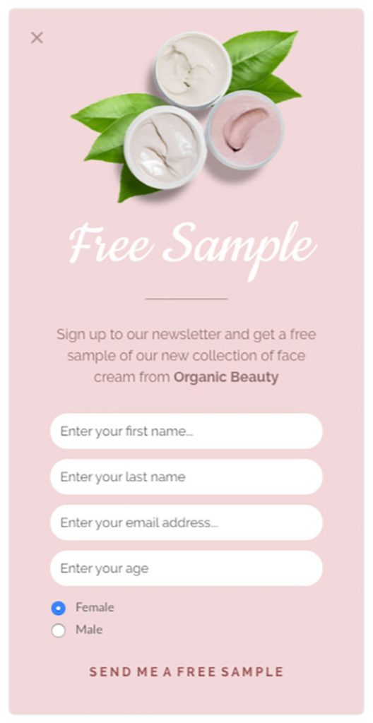
As you can see there are too many fields. Ideally, it’s not a smart approach. As customers are not willing to share their personal information randomly.
However, let’s have a look at another popup example with the same pattern & design but with fewer fields:-
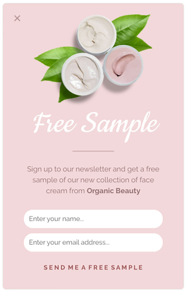
Now, which one would you prefer to fill out? Of course the second one with fewer input fields.
In fact, it’s a smart approach to include fewer input fields for making your popup design stand out. So, it’s not ideal to ask for too much information directly, rather your popup must seem easy & quick. It can easily uplift your business growth generating some potential leads & drive more conversions to your website.
Some Great Popup Plugins for WordPress
Now let’s take a look at some of the best popup plugins to design beautiful popups.
1. OptinMonster
OptinMonster is undoubtedly one of the most popup plugin among WordPress users. Developed by OptinMonster, featurewise it is a great plugin to choose.
- Drag ‘n’ Drop Builder
- Campaign Types
- Campaign Triggers
- Targeted Campaigns
- Seamless Integrations
- Actionable Insights
Price: Starts from $14/month.
2. Popup Maker
Popup Maker is another highly popular popup plugin. It is used by more than 700,000+ active users. With this plugin you can easily create conversion-focused campaigns that will allow you to grow your remail list. Key features of this plugin includes –
- Unlimited Popups & Themes
- 100% Customizable Popups
- Mobile Responsive Popups
- Visual Theme Builder
- Precision User Targeting
- Click Open Popup Triggers
- Multiple Trigger Types
- Popup Analytics
Price: Starts from $87/year.
3. Icegram
Icegram is relatively new yet a very good popup plugin when it comes to unique feature offering. It can help you collect leads using beautiful popups. The features include –
- Sleek user experience.
- Mobile responsive.
- Integrates with top email marketing platform.
- Unlimited popups.
- Different types of popup and optin.
- Multiple display rules and targeting option.
- 50+ high converting popup designs.
- Eye-catchy popup animations.
Price: Starts from $97/year
Ending Notes
The main purpose of this post is to share some important tips regarding popup design. And we believe that if you can follow the tips accordingly, your popups will not only seem great, but they’ll also produce amazing results.
So it’s the right time to utilize popups in a smart way and grasp some design ideas for your popups from this post. And don’t forget to share your thought with us. 😊


As a designer, I had to receive many design requests for pop-up and newsletter. But this blog will give me some ideas about the pop-up. Thanks for sharing the ideas. It will beneficial for me.
Hello Bristy
Glad to hear that you’ve liked our blog and especially this one. Read our other blog to know more interesting things. Cheers😊
[…] as one of the best page builders for WordPress. Along with many more features, you can also create beautiful popups with specific […]
[…] Increases click-through rate (CTR). […]
[…] Increases click-through rate (CTR). […]
[…] Increases click-through rate (CTR). […]
[…] Increases click-through rate (CTR). […]
[…] Increases click-through rate (CTR). […]
[…] Increases click-through rate (CTR). […]
[…] Increases click-through rate (CTR). […]
[…] Increases click-through rate (CTR). […]
[…] Increases click-through rate (CTR). […]
[…] Increases click-through rate (CTR). […]
[…] Increases click-through rate (CTR). […]