
 0
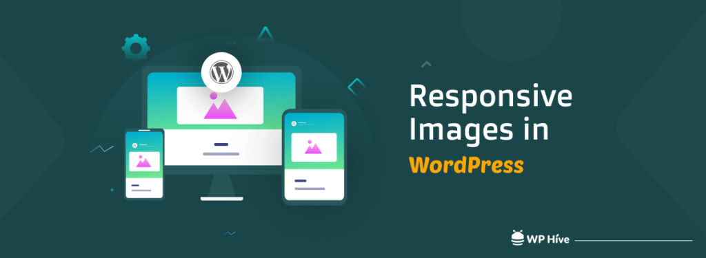
0 WordPress is the most popular way to build a website around the world. With the scope of customization, ease of use, and powerful features, it can take your site to a new level. It offers every possible functionality that is needed for a modern website. That includes the responsiveness of the website and the images as well.
However, every now and then you may face some issues with image responsiveness on WordPress. But why does it happen? To understand, you need to know how WordPress responsive images really work behind the scenes.
This article will give you a detailed idea of image responsiveness, why it is important, and how image responsiveness works in WordPress.
Let’s get started.
What Are Responsive Images on Web?
The term “responsive web design” was coined by web designer Ethan Marcotte in an article he wrote in A List Apart in May 2010. The term Responsive Images is derived from responsive web design and carries quite the same meaning.
Responsive images are a must-have in modern web design today. It’s a standard that has been used by all modern websites.
The idea behind responsive image is to provide the best possible image to fit any screen size, no matter what device your website visitors use.
Today, all of the popular CMSs have built-in functionalities for responsive images and include WordPress as well. Even if you opt for developing a custom website- fluid grid, media queries made it extremely easy to make images responsive.
But why the rush to make images (and websites) responsive? Let’s get to know the reasoning.
Why Do You Need Responsive Images?
The importance and benefits of having responsive images are well-known among web professionals and marketing people alike. From a marketing perspective, it makes perfect sense to have every single image adapt to the viewing screen, no matter what device is used to access it.
After all, people can and will access your site from any device.
You do not want your site visitors to struggle with viewing images on your site on mobile, or any devices for that matter, which is where responsive images come into play.
Responsive images, also known as “adaptive images,” essentially make the image file size adapt to its environment.
For example, you might have an image that is just fine for viewing on a desktop computer but is too big for viewing on a mobile device. The problem arises when the larger image is downloaded on the mobile device and then scaled down to fit on the screen.
This results in pixelation or blurriness in the smaller image because it does not have enough pixels to properly display the image at its full resolution.
To cope with this problem, the concept of responsive images was brought up. This helps to scale down your image so that it retains its original quality when it is viewed from a smaller device.
An added benefit of responsive images is that they will only download when they are needed by the browser, thus saving bandwidth and speeding up page load time.
How Responsive Images Work in WordPress
Before we go on to let you know how WordPress makes images responsive, let’s get to know how responsive feature really works.
If you know even the basic HTML codes, or if you ever peeked into the source of a webpage, you might know something like the below is usually written to display an image.
<img src="image/Test.jpg" alt="Test Image">The above will display an image that will take up the same space, no matter what screen we use to view it.
Now take a look at the code below, which will make the images more adaptive.
<img src="image/Test.jpg"
    srcset="image/Test-small.jpeg 300w,
            image/Test-medium.jpeg 600w,
            image/Test-large.jpeg 1000w,"
    sizes="(min-width: 80rem) 50rem,
           (min-width: 50rem) 38rem,
           (min-width: 45rem) calc(100vw - 10rem),
           100vw"
    alt="A Test Image">
Noticed that we added the tag srcset this time? This tag allows you to define a list of different image resources along with size information so that browser can pick the most appropriate image based on the actual device’s resolution. Meaning you get to make the image responsive, based on the size.
Before version 4.4, WordPress used to display images quite like the first method, which wasn’t particularly responsive.
Also Read: Image Creation Tools to Create SEO Friendly Images for WordPress Blog
However, WordPress 4.4 added support for responsive images as one of its built-in features. To achieve this responsiveness, what WordPress does is create different sizes of your images as you upload a photo. These sizes are –
- Full: This represents the original image size as you upload.
- Large: Represents the max width or height of 1024px
- Medium large: Represents the max width or height of 768px
- Medium: Represents the max width or height of 300px
- Thumbnail: Represents the max width or height of 150px
After creating five versions of the image, WordPress serves the image based on the screen size that is being used to access it.
Adding More Default Image Sizes on WordPress

The highest image size on WordPress is 1024px. Now you may need more than this given that larger screen devices and smartphone screens with high pixel density are coming into the market.
To override the default image size, you have to modify the functions.php file following the below format and specify screen sizes as per your preference.
add_theme_support( 'post-thumbnails' );

add_action( 'after_setup_theme', 'aw_custom_add_image_sizes' );
function aw_custom_add_image_sizes() {
    add_image_size( 'small', 300, 9999 ); // 300px wide unlimited height
    add_image_size( 'medium-small', 450, 9999 ); // 300px wide unlimited height
    add_image_size( 'xl', 1200, 9999 ); // 1200px wide unlimited height
    add_image_size( 'xxl', 2000, 9999 ); // 2000px wide unlimited height
    add_image_size( 'xxxl', 3000, 9999 ); // 3000px wide unlimited height
    add_image_size( 'portfolio_full', 9999, 900 ); // 900px tall unlimited width

}

add_filter( 'image_size_names_choose', 'aw_custom_add_image_size_names' );
function aw_custom_add_image_size_names( $sizes ) {
  return array_merge( $sizes, array(
    'small' => __( 'Small' ),
    'medium-small' => __( 'Medium Small' ),
    'xl' => __( 'Extra Large' ),
    'xxl' => __( '2x Extra Large' ),
    'xxxl' => __( '3x Extra Large' ),
    'portfolio_full' => __( 'Portfolio Full Size' ),
  ) );
}
After you update the code, save the changes to ensure your changes are confirmed.
How to Prevent Issues with WordPress Responsive Images
Now, while WordPress added the support, not all the WordPress themes have srcset implemented by default. That means there are older themes that might not support the srcset attribute and likewise the responsive feature as well. And it may cause you to experience issues with image responsiveness.
To avoid getting stuck with this problem, gather information about the theme to know whether it is using srcset. You can also contact the theme developer directly to know whether they are using srcset or not. We also suggest you choose from the best WordPress themes to avoid such problems.
What’s the Perfect Image Size? Or Is There Any?
The answer is, NO.
There is no perfect image size. It all depends on how the image size you choose adapts to different screens once it is scaled up or down.
If you want to create an image that can be viewed perfectly on multiple devices, then the most important thing is to have an image that’s the correct resolution.
The next most important thing is to get the size of your image right for what you want to use it for. For example, if you want to use your image as the feature image for your blog, which will be shared on social media as well, then the recommended size is 1200 pixels by 628 pixels.
However, your blog header can be of a different size, which might require you to upload an image of that particular size.
Thus, there is no perfect image size and never will be. The best way is to find what size suits your site, can be scaled up or down, and adapt nicely on all devices.
Best Applications to Test Website and Image Responsiveness
There are various tools you can use to test website and image responsiveness. We’ve listed the five best of them below.
Wrapping Up
Responsive images are an important factor in making a site accessible on multiple devices. The basic idea of responsive images is that the browser recognizes the device it’s being displayed on and serves the appropriate image size.
The responsive images feature has been built into WordPress since version 4.4. It allows you to serve responsive images to different devices based on specific breakpoints.
We hope in this article, you get an idea of how exactly WordPress responsive images work and what to do in case it does not work in some instances.
If you have questions regarding the WordPress responsive images, do let us know in the comment section below.

 Email Subscription Request
Add your first comment to this post